
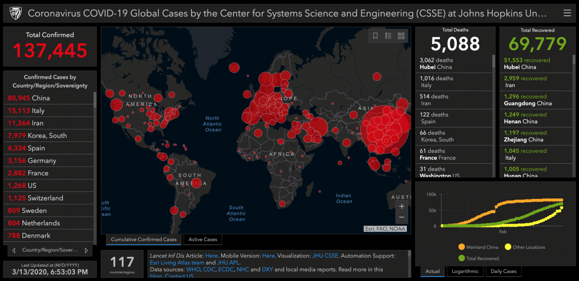
If you are wondering what parts of the world that the Corona Virus has managed to get to, then look no further than this amazing statistical map by our friends at arcgis.com. This map uses data from the WHO, CDC, ECDC, NHC and DXY and local media reports.
These are all really great websites to follow for up-to-date, logical approaches to the pandemic – ain’t nobody got time for fake news and speculation!